About QFC
ABOUT QAULITY FLAVORS
When QFC was established in 2009, based on its past experience in catering services and the experience in the construction and management of catering facilities, it established the company’s "business philosophy" and "code of conduct", and sincerely wants to promote the service concept of the catering industry, through empathy, the concept of emphasizing both quality and service, and the concept of value over price, in the process of selecting catering manufacturers for enterprises.
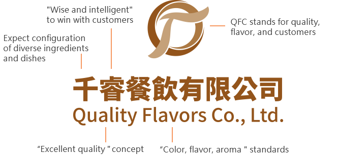
Therefore, with the self-expectation of "diversity and diversity" and the mindset of "wisdom and intelligence" and win-win cooperation with customers, the company is named "Quality Flavors Co., Ltd.". At the same time, in order to bravely challenge oneself, except for the traditional focus on the standard of "color, aroma," the concept of "excellent quality" is particularly added on. Therefore, we picked up "Quality Flavors Co., Ltd." (QFC) as our company name which also carries the meaning of "Quality First" in it. The operation headquarter is located on Industrial 6th Road, Pingzhen District, Taoyuan City, to serve esteemed customers in the industrial park nearby, and then gradually expand the service base to all major economic and industrial parks in Taoyuan. The products and services provided mainly focus on catering-related group meals, exquisite bentos, and kitchen planning and design.
The original CIS of Quality Flavors Co., Ltd. that contains the element of Chinse and English characters.
-
Expect for "diverse" configuration of ingredients and dishes
-
Win with customers through “wisdom and intelligence"
-
Focus on “color, flavor, aroma” and "excellent quality"
Based on the company’s business philosophy of "trust customers, strictly abide by food safety, and improve quality", and the principle of "integrity, pragmatism, dedication, and learning from the benchmark", when QFC set up the corporate identity logo, it decided to take the light tone of warmth and flexibility as the basis to present the soft side of QFC. Finally, it chose a soft complexion to represent qfc’s emotional temperature when serving customers, and designed it into the company’s identification mark with the feeling of "being one family". identify. At the same time, the Chinese and English words of the company’s "Rui" are embedded for recognition.
Then, in May 2023, in order to make it easier for the company to quickly identify and remember, it is necessary to reshape the company’s corporate identity logo based on the main abbreviation of the company name Quality Flavors Co., Ltd. (QFC) so as to present company’s business philosophy and value proposition.
In order to show that QFC believes in customers and is worthy of customers’ trust, the new corporate identity is made of elegant and simple brown, which also expresses trust and stability. Through the quality, taste, and customer priority concept expressed in the three words of QFC, we believe that QFC will be able to create better business results for customers and itself. At the same time, the gradual layering pattern of light to deep color, expressing mutual trust, will inevitably become stronger over time.
Except for color definitions, the English font of QFC shall be consistent with "Arial Regular", while the Chinese font shall be consistent with "Huakang bold bold" to facilitate clear recognition of QFC’s font. When using QFC’s recognition mark, the recognition mark can be processed according to the principle of equal scaling. The following are the corporate logos and corresponding color schemes of Quality Flavors Co., Ltd.:

